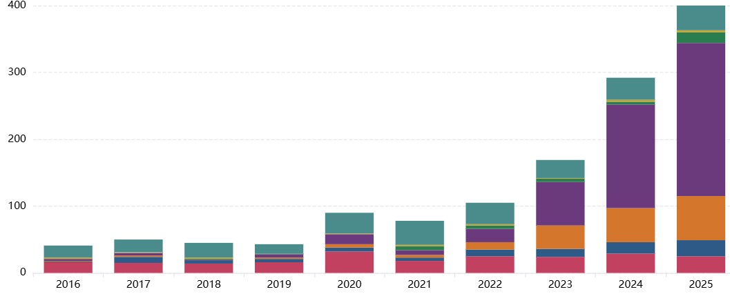
View numbers of reported incidents each year split or filtered by risk domain, entity, timing, harm severity or primary AI purpose.
View how incidents in the AI Incident Database are classified using the MIT AI Risk Repository’s causal and domain taxonomies, along with risk levels defined by the EU AI Act. Filter by risk domain, timing, entity, AI purpose or severity of harm caused.
View detailed analysis of each AI incident in the incident database, including how the incident is classified, how severe the harm is (across 10 categories of harm), and the classification confidence.
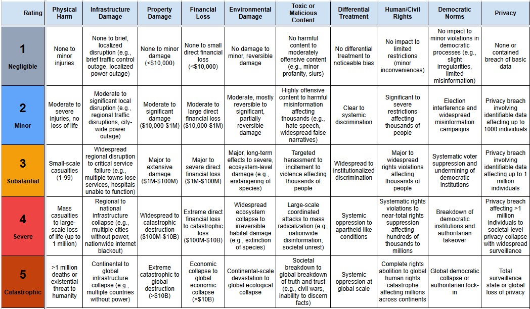
View a harm taxonomy for AI incidents, which distinguishes between 10 types of harm (e.g., physical harm, property damage, financial loss, human rights) based on work by CSET
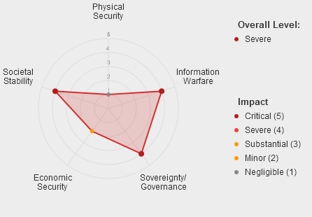
National Security impact assessment for each AI incident in the database, including 5 categories of impact and threat classification (novelty, imminence, autonomy)